Introduction
In the world of DOOH (Digital Out-of-Home) advertising, designing an eye-catching and impactful poster can be the difference between a successful campaign and one that goes unnoticed. With the increasing use of digital signage for advertising, it’s more important than ever to make sure your DOOH posters are not only visually appealing but also optimized for high engagement. Here are some key techniques to ensure your poster grabs attention and maximizes your advertising impact.
When creating a DOOH advertising poster, less is more. Outdoor advertising spaces are often viewed from a distance and for a short time, so the message needs to be clear and easily digestible at a glance. Use bold typography, high-contrast colors, and large visuals to make sure your key message is instantly visible. The design should focus on one central idea or message without overwhelming the viewer.
2. Use High-Resolution Images and Graphics
Poor image quality can ruin an otherwise great poster. Always use high-resolution visuals that won’t pixelate on larger digital signage screens. Check the resolution specifications for the screens where your ad will run, ensuring that your images maintain clarity and sharpness on outdoor advertising displays, particularly for large screens in high-traffic areas.
3. Incorporate Dynamic and Animated Elements
The advantage of digital signage over traditional posters is the ability to include dynamic ads. Movement naturally attracts the eye, so incorporating subtle animations, transitions, or rotating visuals can help your poster stand out. Be careful not to overwhelm the viewer with too many moving elements—focus on a key action or highlight that draws attention to your main message.
4. Optimize for Readability at a Distance
DOOH posters need to be readable from afar, as viewers may be walking or driving past quickly. Use large, legible fonts, and limit the amount of text on the poster. Ideally, your headline should be no more than 5-7 words. Keep your message concise and make sure your call to action (CTA) is clear and actionable, whether it’s “Visit our store today” or “Scan here for more info.”

5. Leverage Programmatic DOOH for Targeted Ads
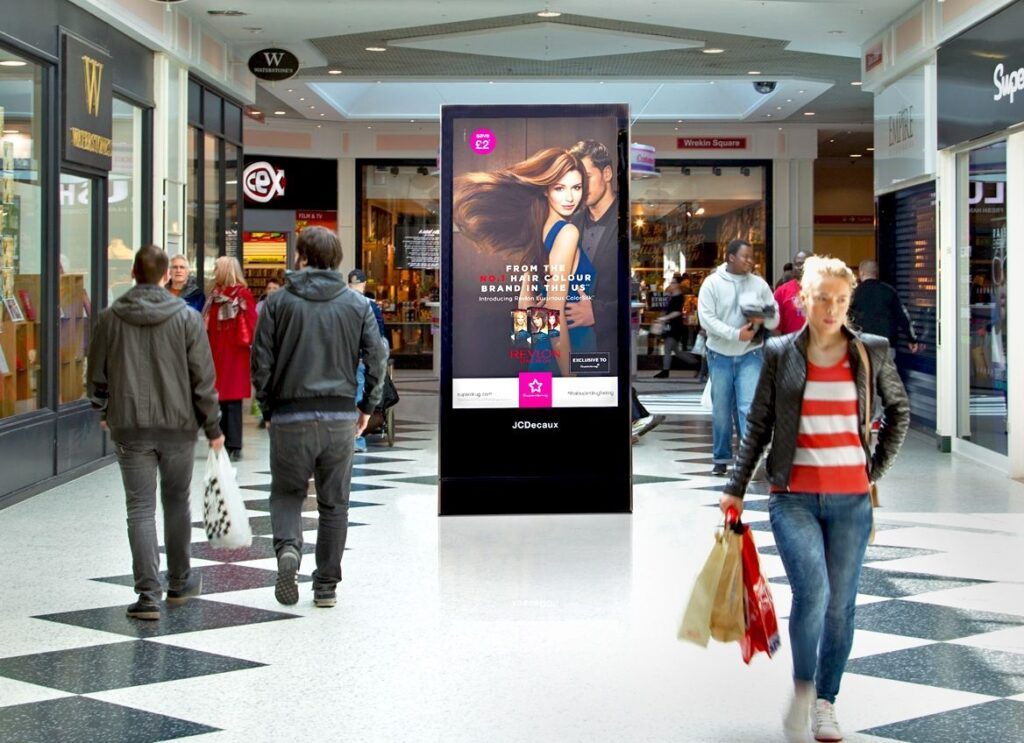
Programmatic DOOH allows advertisers to serve relevant targeted ads to specific audiences, times, and locations. To make your posters more effective, think about the audience you’re targeting. For instance, if you’re running ads at a shopping mall, focus on retail sales or promotions. Personalizing your content to the environment and audience is key to maximizing engagement.
6. Use Bright and High-Contrast Colors
Bright colors and high contrast make posters visually striking. Choose colors that complement your brand but stand out against the backdrop of the digital screen environment. For instance, dark colors like black and navy can get lost on certain screens, while vibrant shades like orange, yellow, or red can help your poster pop, particularly in well-lit or outdoor settings.
7. Include a Clear and Visible Call to Action
Your DOOH poster should have a clear and easy-to-see call to action (CTA). Whether it’s encouraging people to visit your website, scan a QR code, or stop by your store, the CTA should be large enough to be seen from a distance and aligned with your overall campaign objectives. Without a clear CTA, your message may get lost.
8. Utilize Ad Analytics to Improve Design
Once your campaign goes live, use ad analytics to track its performance. Insights like dwell time, impressions, and audience engagement can provide valuable feedback on what aspects of your poster design are working and where you might improve. Adjust future campaigns based on this data for even better results in your screen monetization efforts.
9. Design for High-Traffic Areas
Designing posters for high-traffic ads requires making an impact in a matter of seconds. Whether you’re advertising in a busy shopping mall, train station, or along a major roadway, your poster should communicate its main point within a few moments. Minimalist designs with large, engaging visuals and short text are more likely to succeed in these locations.
10. Test Across Multiple Screens and Formats
Finally, before launching your DOOH campaign, test your poster across multiple screen formats and resolutions to ensure consistency. DOOH platforms support a range of screens from small kiosks to large billboards, so it’s crucial to check how your design scales and adapts to different sizes. This testing phase can help you avoid any formatting issues that might hinder the visibility of your poster.
By following these techniques, you can create DOOH posters that not only stand out but also drive real engagement. From using bold designs and high-contrast colors to optimizing your ads with programmatic DOOH and ad analytics, each step in your design process can help your campaign reach the right audience and achieve its goals.
In today’s competitive advertising environment, leveraging the power of digital signage and dynamic ads is essential for making a lasting impression. With Hype Loop’s easy-to-use digital ad platform, you can effortlessly manage your targeted ads on high-traffic screens and track performance with real-time ad analytics. Start monetizing your screens and reach your audience with Hype Loop today!


